Presentation Design
Loch Lomond
Loch Lomond’s presentations sailed from murky waters to clear, luxurious, whisky-clear smoothness.

The Problem
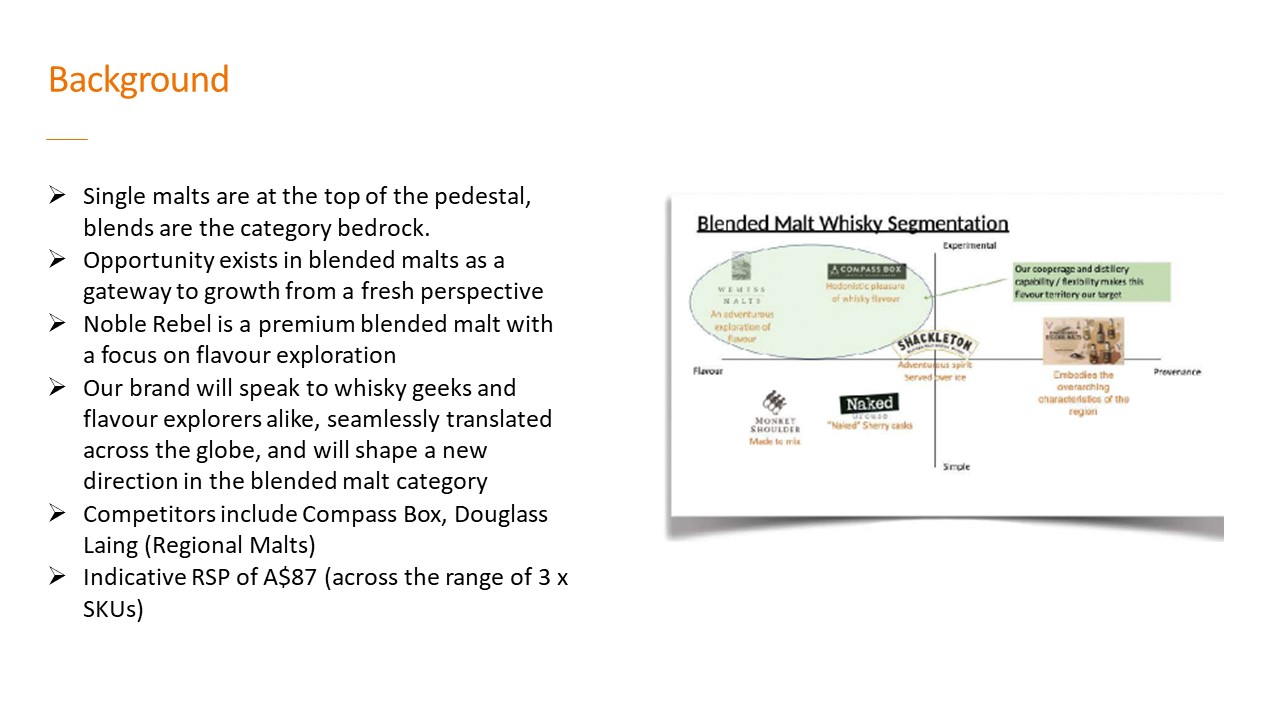
Loch Lomond's decks missed the beautiful clarity synonymous with the brand's luxury whisky. While the messaging was strong, mixed fonts and inconsistent design elements detracted from their story. The slides needed refinement to better align with the sophistication associated with Loch Lomond.
Our Solution
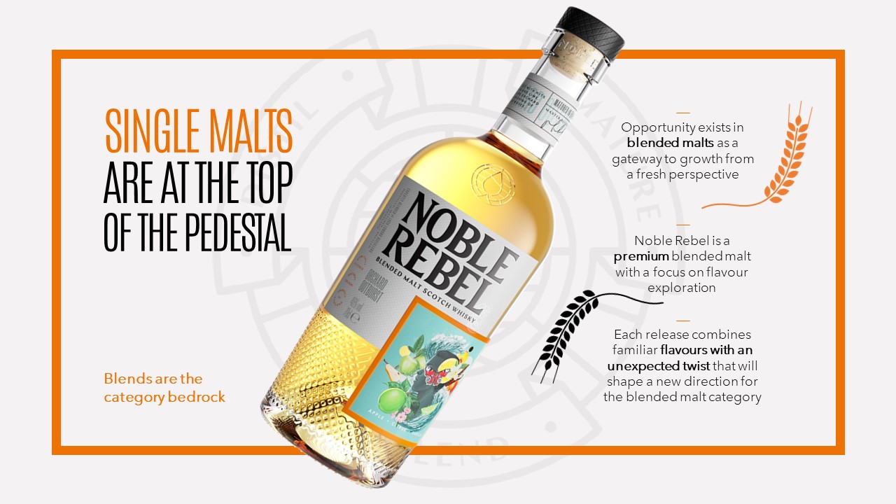
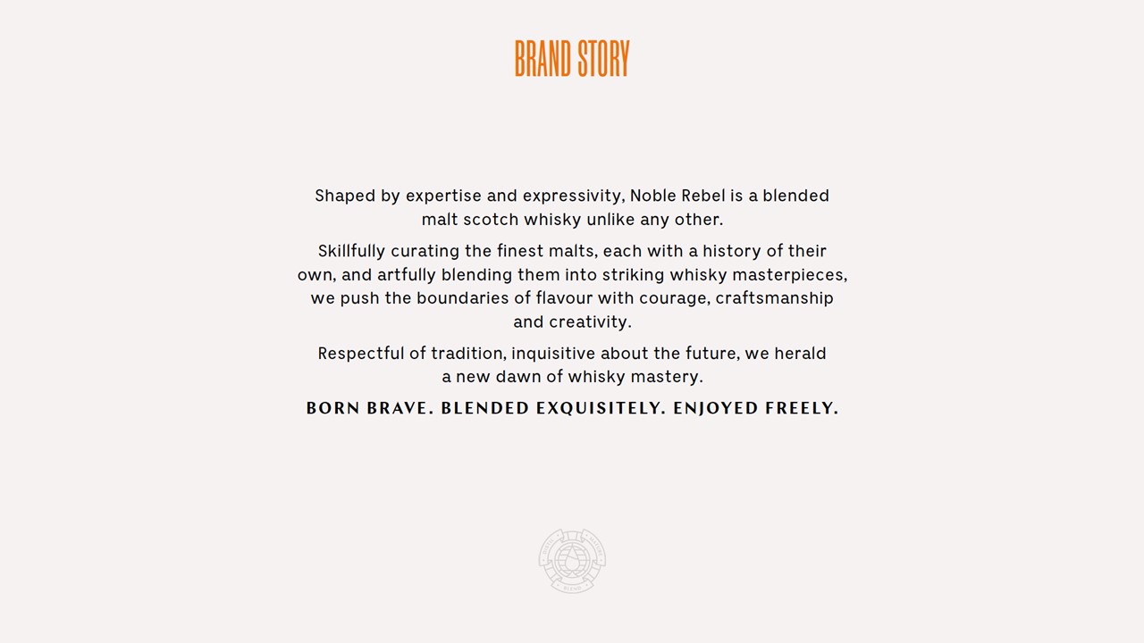
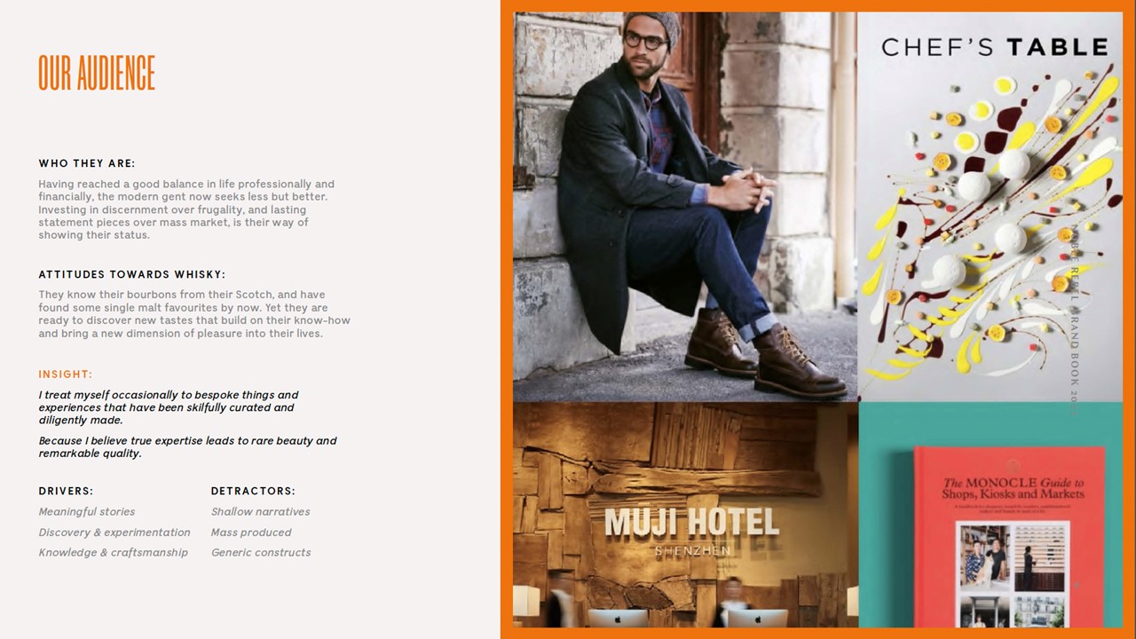
Our team served up dynamic, bold and elegant visuals that radiated the luxury of the brand. We created clear, bespoke designs to reflect the smooth and refined essence of their distilled designs. Our aim was to present a seamless and sophisticated narrative that would captivate the audience.
The Outcome
Loch Lomond’s decks became a smooth pour of their high-end sophistication. Playing around with existing and bespoke design elements, we created a harmonious symphony that resonated like a well-aged malt. The refined decks now shimmer with the elegance of the brand. Distilled, dynamic and downright delicious. Cheers to that.
