Presentation Design
Puma
Puma’s brand roared to life with a big, bold approach.
The Problem
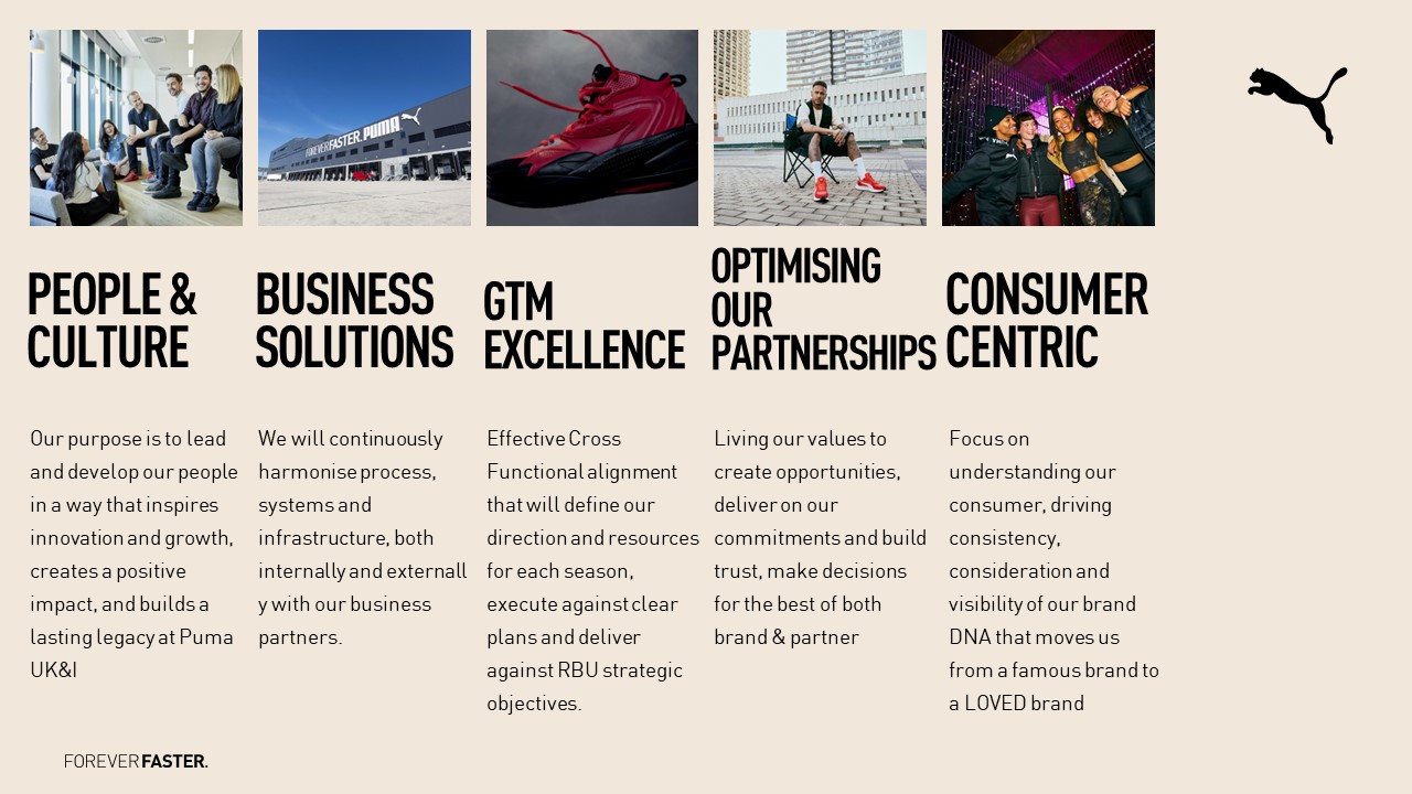
Puma’s presentations were ripe for transformation. While packed with data and findings, they didn’t embody the brand’s fearless spirit. Puma was ready for our team to revamp the decks’ logic and rhythm, reimagine the colour palette and build an engaging narrative.
Our Solution
We kicked off by dissecting the decks into workable chunks to clarify each presentation’s message. With a less-is-more approach, we trimmed down the text on each slide and built captivating narratives into each deck. Finally, we reworked the colour scheme to match the brand's bold palette.
The Outcome
Puma’s new slides were an extension of the brand’s innovative spirit. With a fully branded colour scheme, an engaging structure and a strong, fearless tone, their suite of sleek and cohesive presentations were ready to dazzle any audience.


