Designer Secrets: The Basics of Colour Theory
So, you think colour theory is a whole heap o’ bunkum? Well hold onto your artistic little berets, because it’s time for a technicolour twist. We’re diving deep into the dazzling, dizzying world of colour theory.
The concept of colour theory has been steadily gaining traction over the last couple of years, but it’s been around a heck of a lot longer than that. The colourful breakdown that we know and love today has deep roots, and was actually originally thought up by one of history’s biggest thinkers: Isaac Newton.
Back in the balmy summer of 1666, Newton was having one of his regular playdates with his favourite prism. He shot a beam of light into it (as one does) and out splayed a full spectrum of colours! A rainbow, in simple terms. This discovery led Newton to realise that colour is a product of light. He took that rainbow, wrestled it into a circle and voila – the colour wheel was born.
Newton was the first to colour outside of the lines, but a whole parade of artists and scientists have followed suit since – all adding their very own interpretations and new rules into the mix. Geothe, Chevreul, Munsell, Itten – they’ve all left colourful fingerprints on the history of colour theory. (Here’s a fantastic article from Maria Popova about some of that game-changing cleverness).
Colour theory goes beyond the simple classification of colour into warm and cold, complementary and analogous. Colour theory also has a psychological branch, where the sorts of people who like to put other people into neat little personality boxes attach human feelings onto innocent colours.
What’s colour psychology?
Put simply, colour psychology is the pseudoscientific study of how certain hues might affect human behaviour and feelings. Some people think that specific colours are linked to the whipping up of specific emotions, and can even influence our behaviour.
For example, it’s pretty accepted (in the West, anyway), that red can stir up feelings of intensity and excitement, while blue imbues calm and serenity. Lots of studies have attempted to accurately unpick the truth of these claims. One of the most famous is for the colour pink.
The history of pink
There’s a specific shade of pink, called Baker-Miller Pink, which some studies report to make prison inmates less violent. But other studies show that Baker-Miller Pink has no discernible effect on the violence levels of prison inmates. It entertained us to notice that those directly contradictory studies have an author in common.
We can see this potential for shifting colour meanings by taking a closer look at the colour pink. Pink has alternated meaning, gender assignations and symbolic representations over the year. A 1972 issue of Time Magazine printed a survey of US stores on gender-appropriate colours that showed 60% of respondents assigning pink to boys, not girls, which flies in the face of modern gender division of colours.
Whether or not colour has an instinctive effect on human psychology continues to be up for debate. But we undoubtedly have culturally accepted meanings for commonly-used colours. These learned associations might not be cross-cultural, or even historically consistent within a culture, but they’re interesting nonetheless.
What could colour convey?
With that cultural colour bias in mind, here’s our quick and dirty run-through of the potential impact of colours on our Western feels:
- Red: it’s bold, baby! Red is the colour of passion, excitement, danger and anger. It’s a high-energy colour that can quicken the heartrate and stir up the senses.
- Orange: the hug you didn’t know you needed. Orange is friendly, inviting and energetic, often associated with creativity and adventure.
- Yellow: the colour equivalent of an energetic and endearing Labrador puppy. Yellow is the shade of sunshine, optimism and happiness.
- Green: Mother Nature’s fave shade. Green is the colour of relaxation, of tranquillity, of growth and renewal.
- Blue: float serenely on a calm sea beneath a cloudless sky. But in a good way, not in a scary, shipwreck sort of way. Blue promotes calm, trust and reliability. No wonder it’s a corporate logo favourite.
- Purple: luxury, royalty and sophistication. Purple is decadence, colourified. It’s also associated with creativity, imagination, magic and (for us at least) Cadbury’s choco.
- Black: as mysterious as it gets. Black is often associated with power, elegance and formality, but it can also evoke feelings of sadness and negativity.
- White: purity, innocence, simplicity. White is often used to evoke a sense of cleanliness and safety.
Feel free to file all that info away as unproven but (hopefully) interesting. Most of the well-publicised ideas around colour psychology, like the colour vibes we’ve summarised, are broadly oversimplified.
You can easily separate the pseudoscience of colour theory from the consistent framework defined in non-psychological colour theory. Read on to find out more.
Successfully spinning the colour wheel
Colour theory is the rulebook for using colours properly, and it’s all based on how colours interact, contrast and complement each other on the colour wheel.
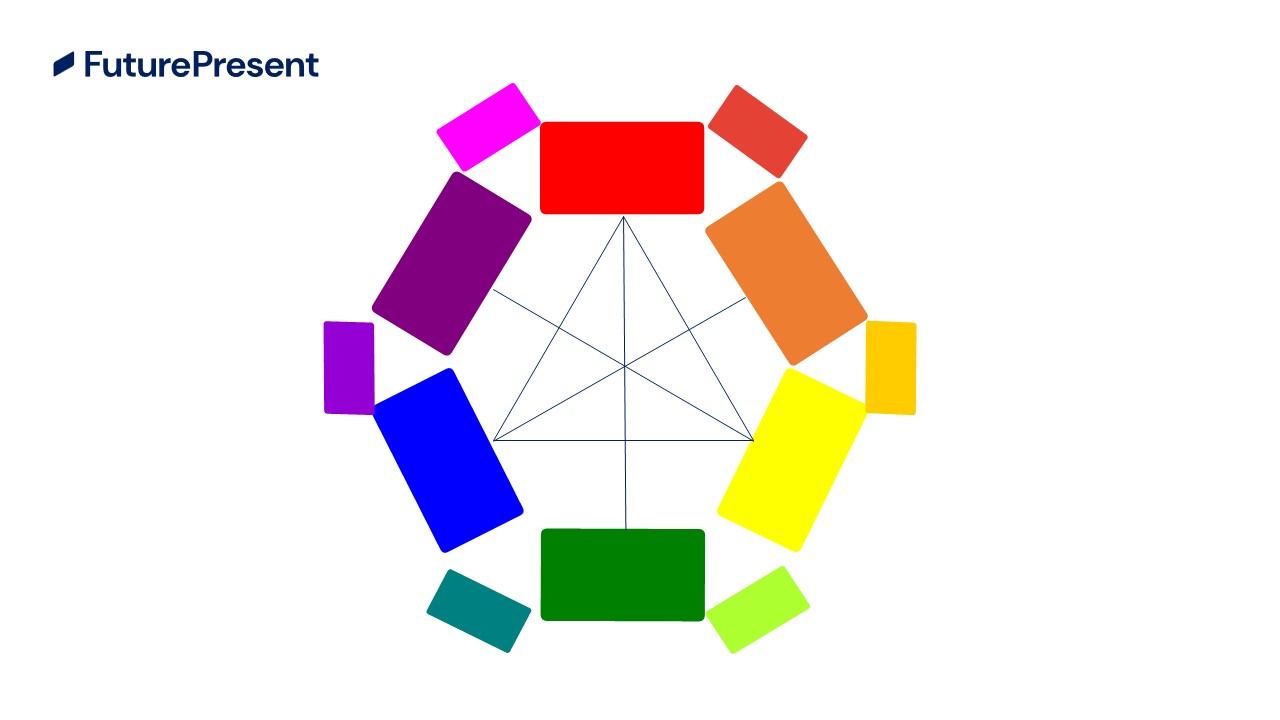
The standard colour wheel is centred around the primary colours (red, yellow and blue), the secondary colours you get when you mix together two primary colours (orange, green and purple), and the tertiary colours that come from mixing the primaries and secondaries (magenta, vermillion, amber, chartreuse, teal and violet).
The colour wheel is a cheat sheet to create a visually harmonious masterpiece, whether that means in painting, web design, your outfit or, you guessed it, in your presentations.
Colour theory also lets designers and laypeople alike navigate the tricky business of colour harmony – of finding the perfect blend of visual tension and peace.
Complementary colours

The colours facing one another on the wheel are complementary colours – red and green, blue and orange, purple and yellow. When they’re used together, complementary colours create a strong contrast and make each other pop.
Analogous colours

Analogous colours are when you group a trio of colours together that are adjacent on the wheel. For example, yellow, chartreuse and green make up an analogous colour scheme. Good examples of how this could pan out are things like fiery sunsets or calming seascapes – both of which are often made from analogous colour groups.
Analogous colours create harmonious designs with a built-in sense of soothing unity.
Triadic colours

Triadics make for jazzy colour trios. Triadic colours are three equidistantly-spaced colours. Red, yellow and blue, and orange, green and purple are examples of triadic colours. They create vibrant, lively designs when used together, even when they’re desaturated.
Split-complementary colours

This is a variation on complementary colour schemes. To find the split complementary scheme, you take a single base colour you want at the heart of your design, find its complementary colour (the one directly opposite on the wheel). Then, instead of using that, you take the colours on either side of the complementary colour to create your scheme.
This gives high-contrast designs, like in classic complementary colour schemes, but with less visual tension.
Tetradic and square colours

Tetradic colour sets involve four separate shades – two sets of complementary colours. It’s a scheme that’s often hard to harmonise, but it’s impressive when you get a proper balance.
Square colour sets also involve four colours, but they’re evenly spaced around the colour wheel. As with tetradic sets, square colours schemes can be tricky to perfect, but the contrast when you achieve success is visually impactful.
Painting perception: the role of colour in presentations
Colour is the invisible narrator in your decks. It sets the mood, guides the eyes of your audience, and influences perception on the information you’re conveying.
Here are some examples. A presentation on sustainable business practices might use earthy greens and browns to invoke the ethos of nature preservation. But a presentation that talks about cutting-edge tech startups might opt for a sleek monochromatic palette of greys and blues to evoke a futuristic sense.
Stick withing these sorts of rules to keep your decks visually cohesive. Or, subvert colour expectations to surprise your audience.
The impact of colour goes beyond setting the mood, creating contrast and defining hierarchy. A properly thought-out contrast based on colour theory can guide audience to see, and think, the way you want.
Avoiding colour catastrophe
Colour theory can seem like an intimidating premise. It’s not uncommon for novices to find themselves ensnared in chromatic conundrums. Clashing colours can create jarring decks that distract instead of captivate. Over-similar colours will fail to arrest interest.
But the spectrum of potential pitfalls isn’t limited to the choice of colours alone. The cultural context of colours needs consideration – especially if you’re presenting to a multicultural audience.
White, for instance, is associated with purity by some cultures. In others, white symbolises mourning. In the west, red is most often associated with passion, love, danger and desire. But in the East, red is the colour of luck, joy and prosperity.
Ignoring these kinds of cultural nuances can lead to psychological miscommunication, and could even offend your audience.
Lastly, whilst it’s essential to create a harmonious colour scheme, it’s equally crucial to keep a design clean. Overloading a deck with too many disparate colours will lead to visual chaos, diluting the impact of your narrative.
Practical tips for navigating the colour canvas
Embracing colour theory can transform your decks from bland to brilliant. But how do you apply it effectively? Begin with your brand colours.
If your brand colours are harmonious, and are conveying your message effectively, you’re off to a good start. If they aren’t, consider tweaking them, or pivoting into different complementary shades to make your core colours pop.
Next, remember the 60-30-10. This classic principle dictates how much of each slide should be in your presentation’s primary colour (60%), your secondary colour (30%) and your tertiary accent colour (10%). Sticking roughly to these proportions provides visual balance and helps to guide your audience’s eyes naturally through your deck.
Encouraging accessibility across every deck
Every member of your audience matters, and everyone deserves to bask in the technicolour glory of your deck. Ensuring comprehensive engagement is about more than keeping your content sharp or choosing colours that make your slides look pretty (although that is a bonus). It’s about making sure that your audience, regardless of any visual impairments they may have, has the same presentation experience.
So how do you do transform your decks into an all-inclusive colour party? Let’s break it down.
- Contrast is king – maximise readability by making sure you have a high contrast between your text and your background. Use a colour contrast checker like this one to ensure that your slides are always readable.
- Beware of colour-only info – using pie charts on your deck? That kind of colour-only chart might look snazzy, but a colourblind audience member might not be able to tell where the breaks between sections lie. Always supplement colour coding with patterns, labels or shading styles to make it extra clear.
- Testing, testing, 1,2,3 – there are loads of tools you can employ to check your decks for accessibility. WebAIM is chock full of great advice, or you can use a Chrome extension like Colorblindly that simulates how a colourblind audience member will see your deck.
Making your presentations accessible isn’t just a nice-to-have; it’s a must-have. By using tips like these, you can make sure your message comes through loud, clear and colourful for every single audience member.
The moral of the story
Colour theory isn’t just some fluffy concept artists like to jabber about. It’s a tried-and-true way of amping up your presentation game. So, next time you’re tempted to overlook it, think again. Jump straight into the colour pool and make a splash! Or just get one of our designers to do it for you.
Recommended Reading


Don't struggle with your presentations, let us
help you with your next project.
Comments